Flowganise

Freelance UX Designer
UX strategy, wireframing, UI design
Figma, NuxtUI (Tailwind)
Background:
Flowganise had already built and launched V1 of their platform – an analytics tool that detects where sites are losing customers, identifies the problem and suggests how to fix it. This was enough to secure first round startup funding, but the founder was itching to keep moving.
I helped them scope the feature set for V2, designed the interface and built a design system.
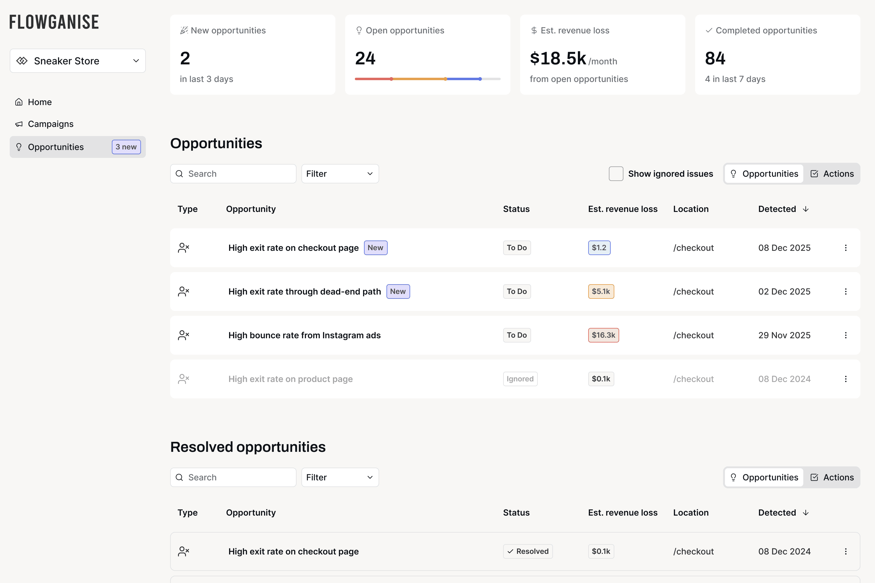
Above: Flowganise dashboard showing open opportunities.
Approach
Analytics tools have a reputation for being difficult to wrangle. Lots of data, lots of dashboards – hard to understand unless you know what you're looking at.
The idea behind Flowganise is the opposite: it does the analysis for you and tells you what to fix.
The trick was translating a mountain of incomprehensible data into something simple. Their users aren't data scientists, they're time-poor business owners who just want to know what's broken and how to fix it.
MVP definition
We workshopped V2 to scope out what was vital to the mission. We iterated with Lovable prototypes to help visualise functionality and tangibly experiment with ideas before committing to anything.
Wireframing
Foundational work: clear information hierarchy, intuitive controls and simple language. Their target customers are frustrated by the analytics tools they were using – I needed Flowganise to be the opposite.
3
Testing
We walked through the WIP designs with existing customers to help validate the direction. We wrestled with terminology, graph types and whole features were deprioritised due to the feedback.
4
UI and Prototypes
I built a tokenised design system in Figma based off NuxtUI (a Tailwind library), customised to suit the Flowganise brand.
We continued checking in with customers as prototypes took shape so by the time we reached handoff, we had full confidence.
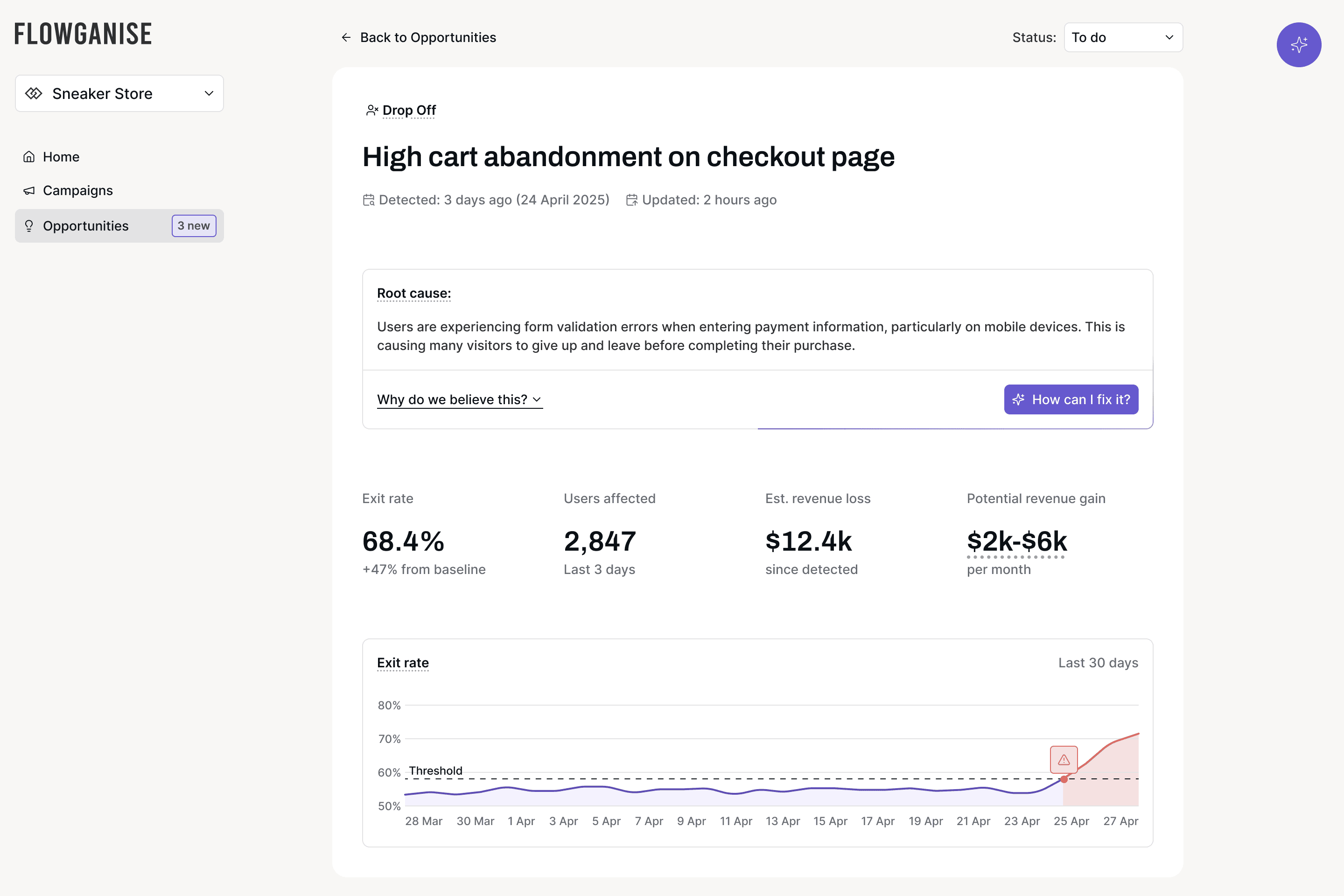
Above: An issue detected! The data is there to dig into, but the root cause is what customers need to know most.
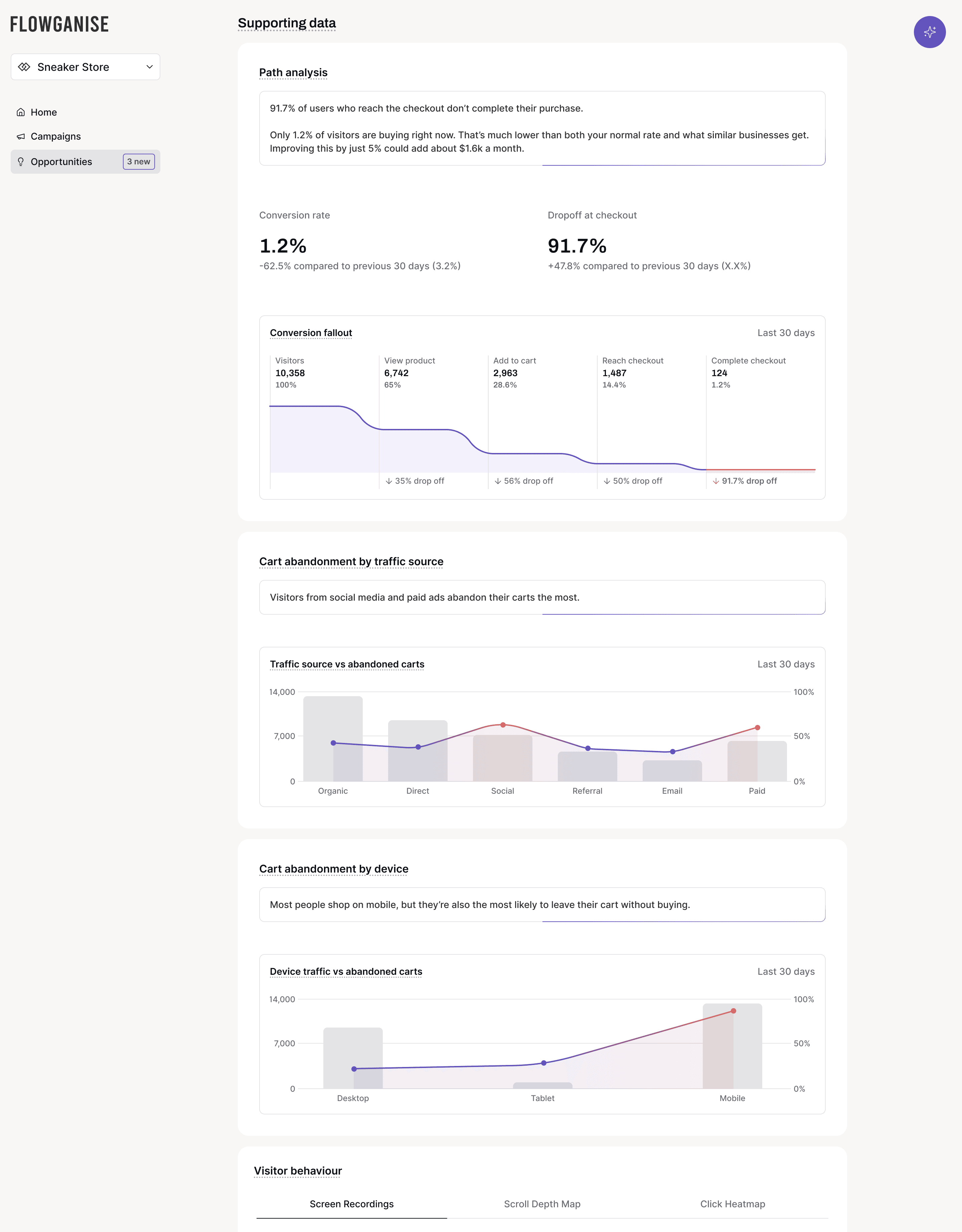
Above: Supporting data for the detected issue – clearly presented with a simple explanation of each graph.
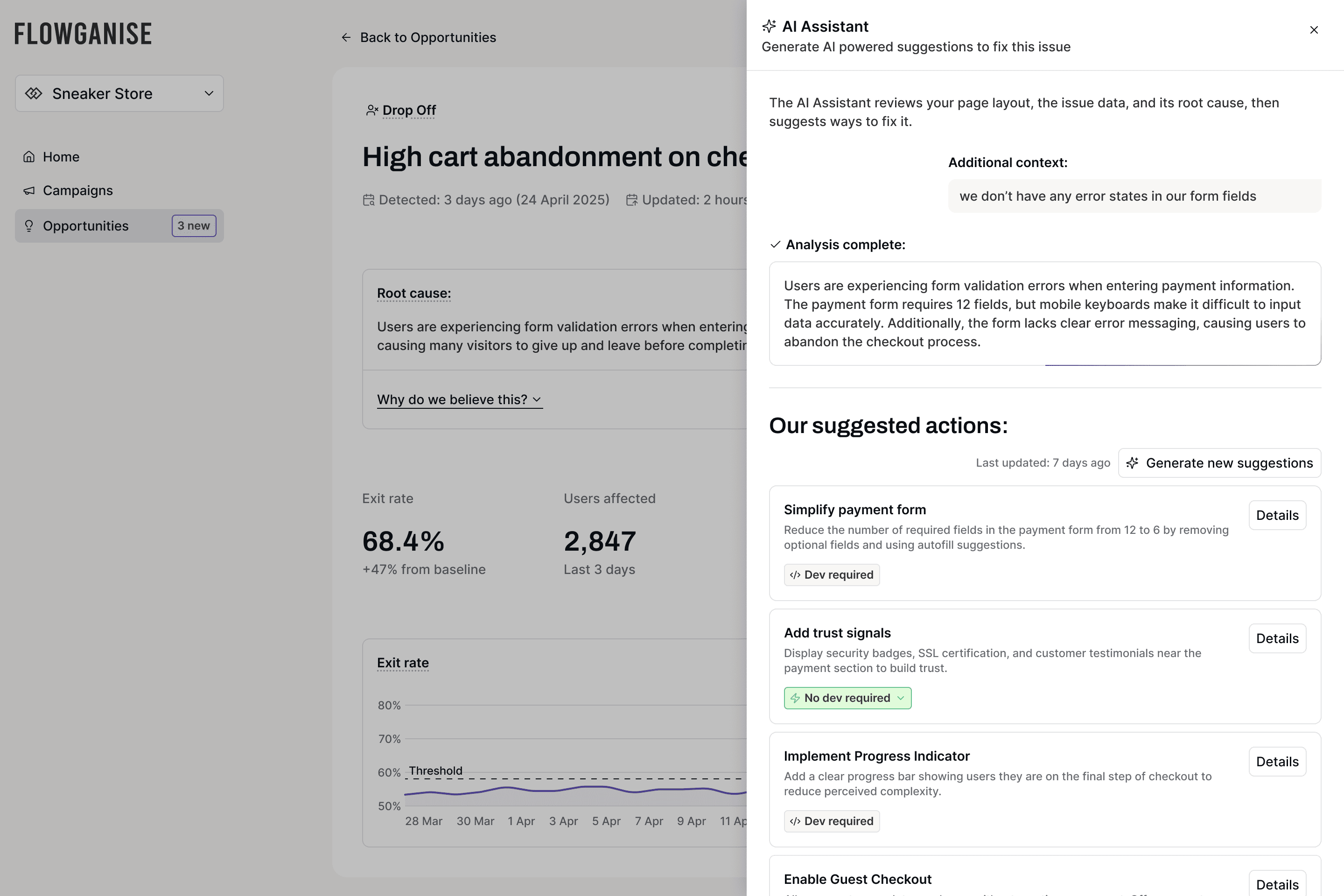
Above: The AI analyses data, screenshots, screen recordings and heat maps then generates suggestions on how to fix the problem.
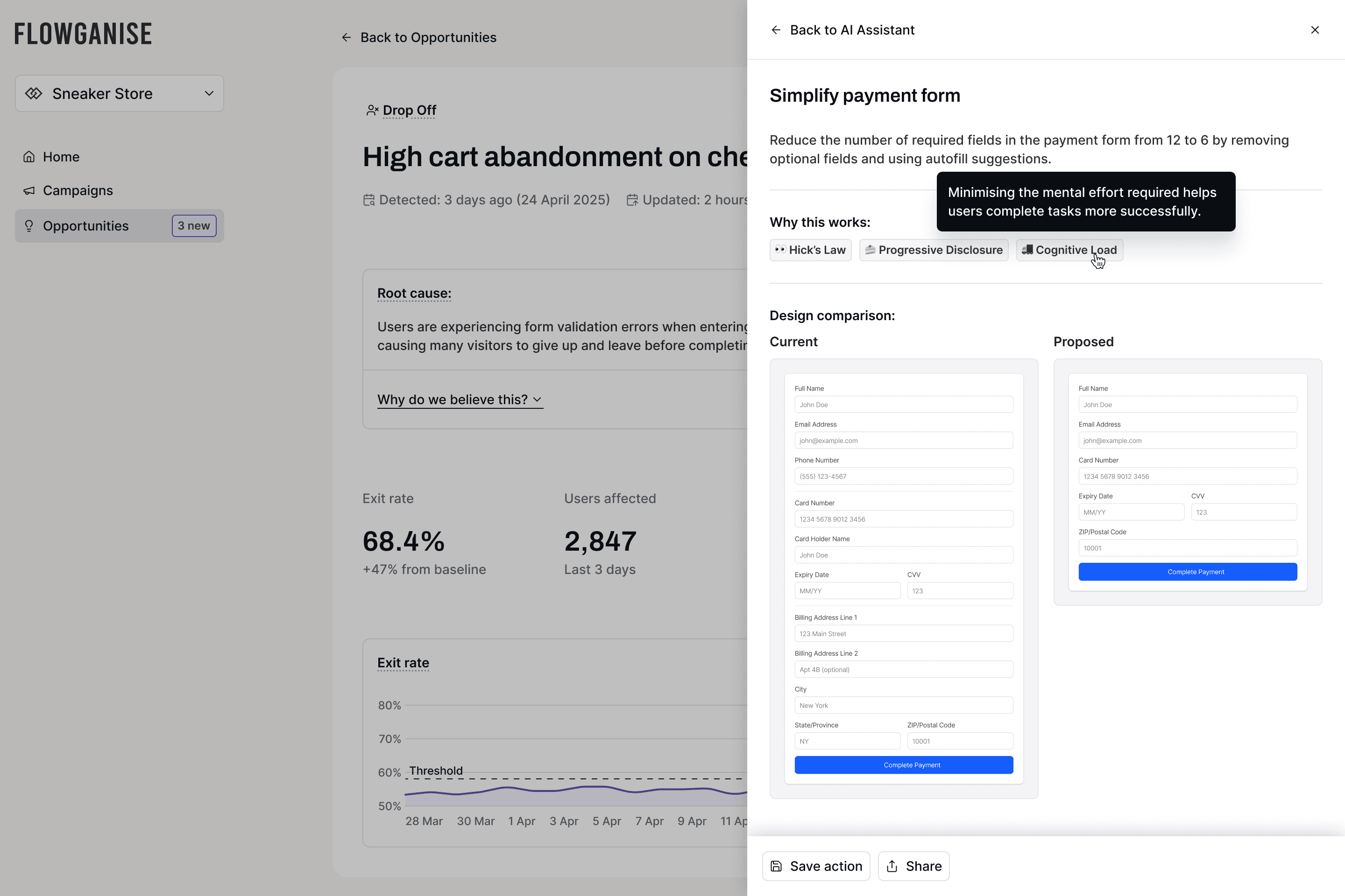
Above: Jumping into a suggestion explains what to do, the UX principles behind why it should work, and a mockup of what the updated screen should look like.
Impact
Version 2 is currently in beta with customers currently signing up for early access.
My work gave the product a coherent structure, some powerful new features and a branded UI system the developer could implement quickly and extend as the product grows.
Want the nitty gritty?
This case study's pretty light on detail—NDAs and all that. Get in touch if you want to talk shop.